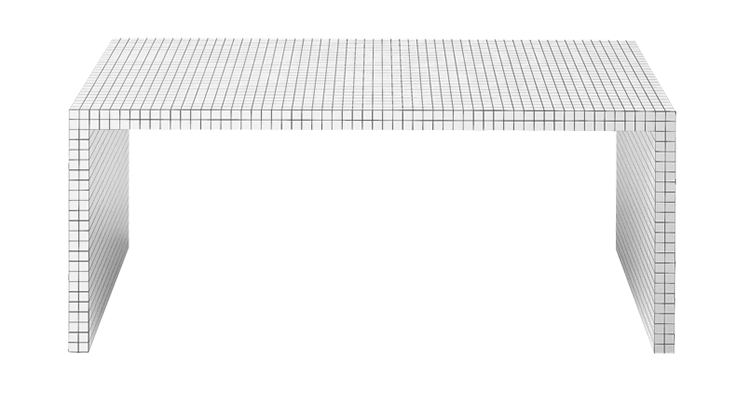
Quaderna Desk 2830

Design Superstudio - 1969-72
1A_PNG_QUADERNA
Stores Contacts

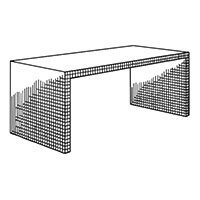
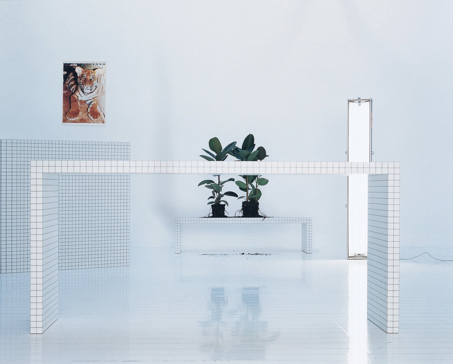
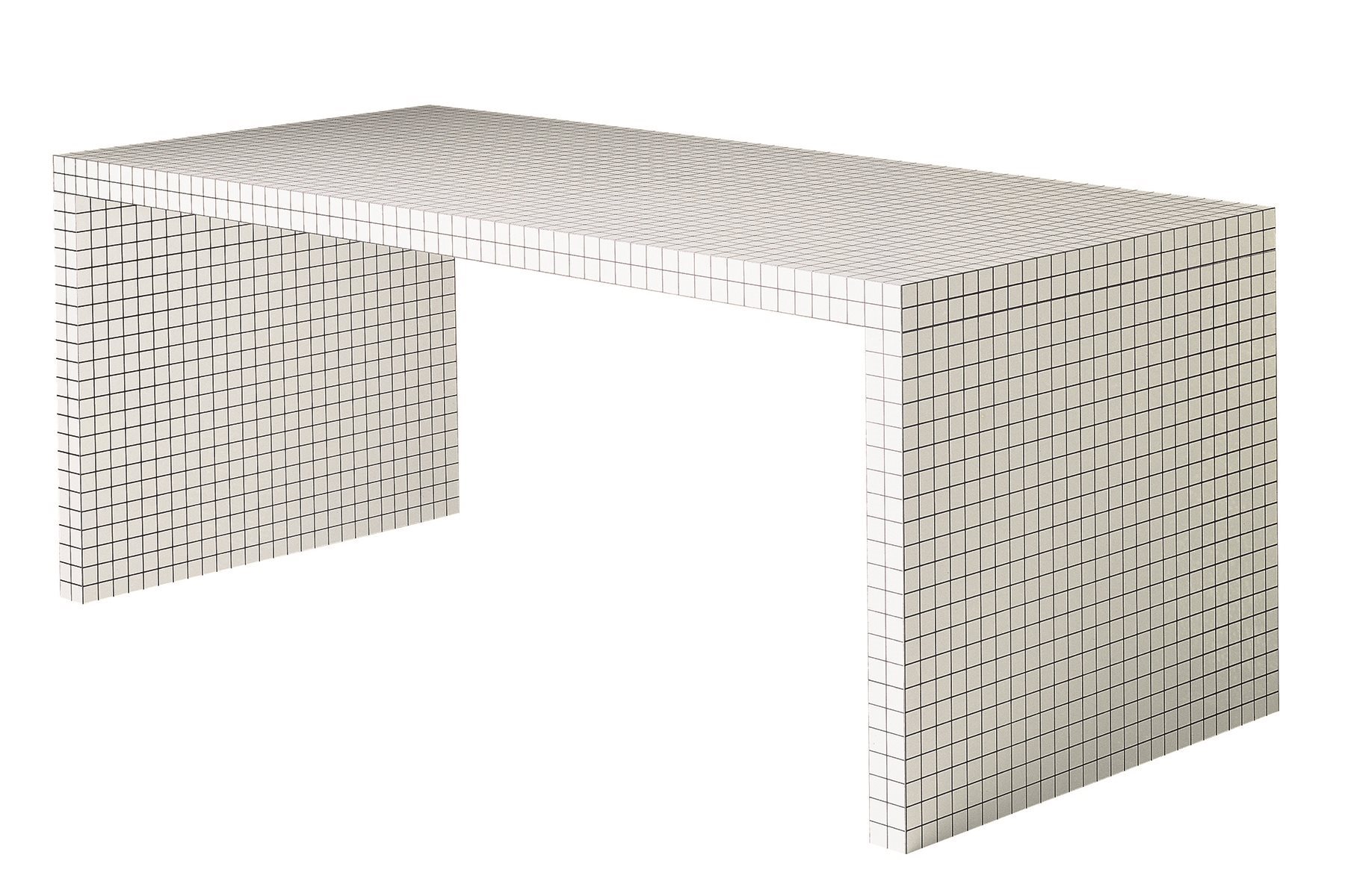
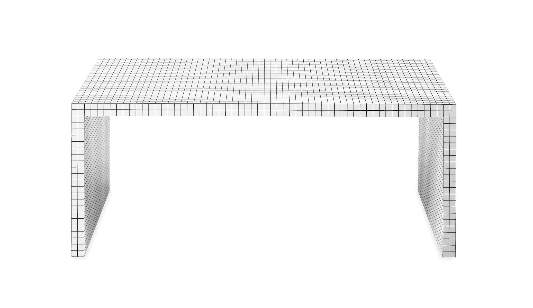
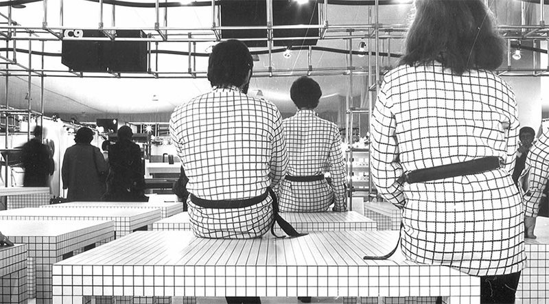
Table/writing desk. Honeycomb core structure coated with white plastic laminate, digitally printed with black squares at 3 cm spacing.

zanotta_2830_quaderna_gallery_1_zoom
quaderna_ip01
a(4)
zanotta_2830_quaderna_gallery_2_zoom

Superidea

What we are talking about here are the terrible kids of Superstudio. In other words, in a given time in history when everything had to be criticised and rethought, in a season when the Italian architecture was passionate and which is now a myth, a group of young students wished to change the world from Florence and definitely managed to leave their mark, at least in our world, the design world. They began with the ‘constant monument’ idea, which wrapped up everything such as a squared magma, continued with the ‘histogram of architecture’, which generated without any effort furniture and ambiences whose “Super-surface was a mental attitude model,” and then finally arrived at the ‘Super-idea’, which beats time with a constant regularity, deliberately written in black and white, conceptually revealed and theoretically closed, eventually generating the Quaderna collection, the most architectural items ever seen in the long history of furniture, which Aurelio Zanotta was ready to turn into a myth.

zanotta_710-quaderna_plus_1
zanotta_710-quaderna_plus_2

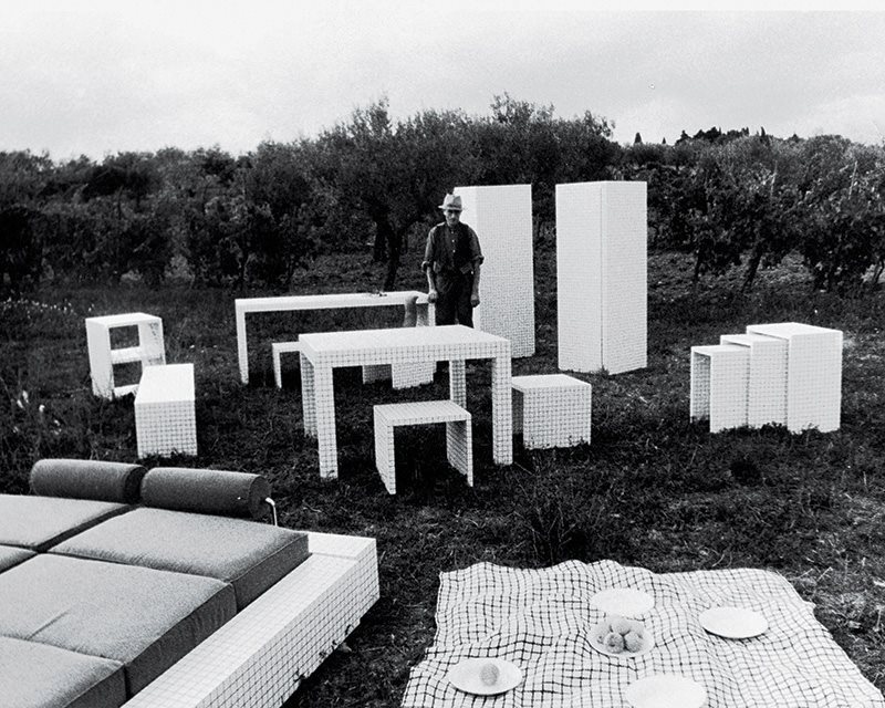
A family of unique and timeless furniture takes shape, an icon based on regular geometric shapes covered with squared white laminate (created on purpose by Abet Print, designed by Superstudio, and called Misura) and characterized by strict volumes, simple and perfect. A real "artificial landscape" extensible as you wish, neutral and strong at the same time: a single squared top "with legs" that becomes a table and space, as well as a chair, bed, bench, cabinet, stool.